At a recent data science sharing session at Choreograph, I delivered a presentation on developing a chatbot using ChatGPT and Streamlit. While this project draws inspiration from previous work, it introduces two pivotal enhancements:
- plotting capabilities
- Query and interact with your own data
Over a series of two articles, I will go through the core components of these new features and describe how prompt engineering can help us visualise the data in chat-bot framework. I will also show how one can query and visualise their own data using a LangChain pandas dataframe agent, creating an end-to-end data analytics experience for technical and non-technical users.
Disclaimer: The proposed solution is for demostration purposes. It has not been fully tested and there will be cases and datasets where it breaks. Use it with caution and adapt it accordingly.
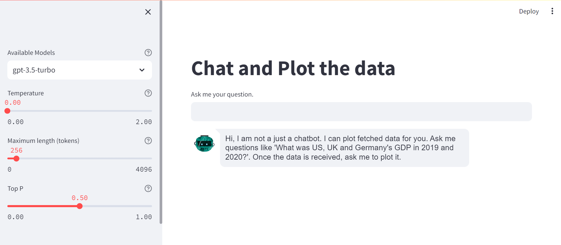
First, I created a simple chatbot, following previous work and adding some model hyper-parameters, like Temperature, Maximum tokens and Top P, that control the model output. In contrast to previous work, this is a generic chatbot. Here is a screenshot of the landing page.
The plotting feature
In order to plot data fetched from the ChatGPT, I use a detailed prompt to instruct the language model of the actions it needs to take. Here is the prompt
Generate the code <code> for plotting the previous data in plotly,
in the format requested. The solution should be given using plotly
and only plotly. Do not use matplotlib.
Return the code <code> in the following
format ```python <code>```
I want my plot to be produced with Plotly. After some trial and error, I had to emphasise repeatedly that it must use plotly and not matplotlib, as I found that it hallucinated sometimes and produced a matplotlib plot instead.
The instruction should be clear and when code is expected it should be highlighted with a keyword <code>. Also, the output should be returned in a specific format so that the generated code can be extracted and used. For this reason I asked the LLM to return the output in triple quotes including python for reference.
I use a regular expression to extract the generated plotly code from the reponse
# code extracted from the src.llm_utils module
def extract_python_code(text):
    pattern = r'```python\s(.*?)```'
    matches = re.findall(pattern, text, re.DOTALL)
    if not matches:
        return None
    else:
        return matches[0]
If the generated response does not contain the code in the specified format, but a plot has been requested, a warning message is displayed. This could be due to two reasons:
- The LLM could not identify any data in the previous responses.
- The maximum number of tokens is too short and the generated answer is cut-off, hence the response does not comply to the output format. In this case consider increasing the number of tokens.
Next, I want to display the generated figure on my streamlit app. For this reason, I remove fig.show(), that it might be generated in the answer and feed the figure object into the st.plotly_chart() for display. I display the generated plotly code, so the user can review it and identify any potential issues. Finally the produced code is executed.
# code extracted from the src.llm_utils module
code = extract_python_code(
    response["choices"][0]["message"]["content"])
code = code.replace("fig.show()", "")
code += """st.plotly_chart(fig, theme='streamlit', use_container_width=True)"""
st.write(f"```{code}")
exec(code)
Example #1
For the following examples I use gpt-3.5-turbo, temperature = 0.0, and Top P = 0.5. For the first example I use the default maximum length 256.
Let’s start with a simple example. I ask the following question
- User: “What was US, UK and Germany’s GDP in 2018 and 2019?”
-
Assistant: “In 2018, the GDP of the United States was approximately $20.58 trillion, the GDP of the United Kingdom was around $2.83 trillion, and the GDP of Germany was about $3.98 trillion.
In 2019, the GDP of the United States increased to approximately $21.43trillion,the GDP of the United Kingdom was around $2.83 trillion, and the GDP of Germany increased to about $3.86 trillion.”
For the time being I don’t focus on the validity of the data, my focus is on the plotting capabilities. Obviously, be cautious with factual responses generated by an LLM
My next question is to plot the data in bar plot.
- User: “Can you plot this data in a bar plot?”
- Assistant:
  years = ['2018', '2019']
  us_gdp = [20.58, 21.43]
  uk_gdp = [2.83, 2.83]
  germany_gdp = [3.98, 3.86]

  fig = go.Figure(data=[
      go.Bar(name='US', x=years, y=us_gdp),
      go.Bar(name='UK', x=years, y=uk_gdp),
      go.Bar(name='Germany', x=years, y=germany_gdp)
  ])

  fig.update_layout(
      title='GDP Comparison - US, UK, Germany',
      xaxis_title='Year',
      yaxis_title='GDP (in trillion USD)',
      barmode='group'
  )


  st.plotly_chart(fig, theme='streamlit', use_container_width=True)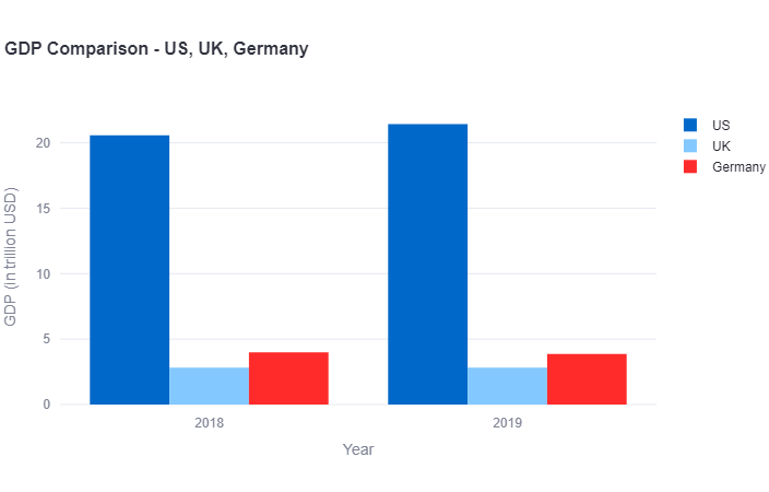
The assistant produces the plotly code required for generated the bar plot and displays it. It also produces the plotly plot, which is interactive, meaning that one can hover-over, zoom-in and save the plot.
Example #2
As a second example, let’s try to fetch more data. Since the answer is expected to be longer, let’s increase the maximum number of tokens to 1000.
- User: “What was the annual GDP of US, UK and Germany from 2010 to 2020? Report annual values and return results in a tabular form”
- Assistant:
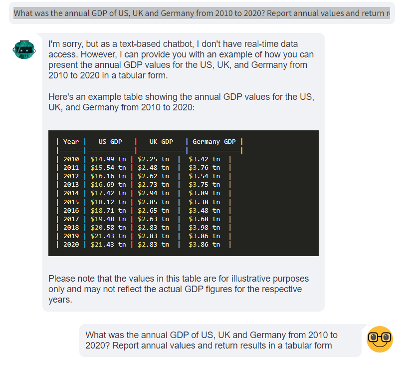
As one can observe, the assistant returned the data in a tabular format as requested. Again, we don’t focus here whether the data is accurate, as we demonstrate the capability of interacting with data and plotting it.
- User: “Can you plot this data in a timeseries plot?”
- Assistant:
  years = ['2010', '2011', '2012', '2013', '2014', '2015', '2016', '2017', '2018', '2019', '2020']
  us_gdp = [14.99, 15.54, 16.16, 16.69, 17.42, 18.12, 18.71, 19.48, 20.58, 21.43, 21.43]
  uk_gdp = [2.25, 2.48, 2.62, 2.73, 2.94, 2.85, 2.65, 2.63, 2.83, 2.83, 2.83]
  germany_gdp = [3.42, 3.76, 3.54, 3.75, 3.89, 3.38, 3.48, 3.68, 3.98, 3.86, 3.86]

  fig = go.Figure()

  fig.add_trace(go.Scatter(x=years, y=us_gdp, name='US'))
  fig.add_trace(go.Scatter(x=years, y=uk_gdp, name='UK'))
  fig.add_trace(go.Scatter(x=years, y=germany_gdp, name='Germany'))

  fig.update_layout(
      title='Annual GDP - US, UK, Germany',
      xaxis_title='Year',
      yaxis_title='GDP (in trillion USD)'
  )
  st.plotly_chart(fig, theme='streamlit', use_container_width=True)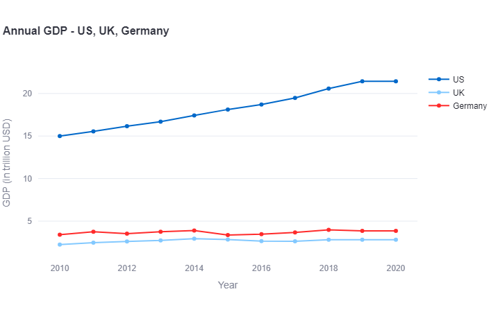
This is a great plot which was generated with two questions to the assistant.
Conclusion
Clever prompt engineering can give a way to plotting data in a chatbot. In this article we focused on data fetched from a LLM, overlooking the data’s validity.
In the [next article((https://giasemidis.github.io/2023/09/30/chatgpt-chatbot-and-plot-own-data.html))], I explain how one can interact, query and plot with their own data in csv format.